接上文
一、项目概述
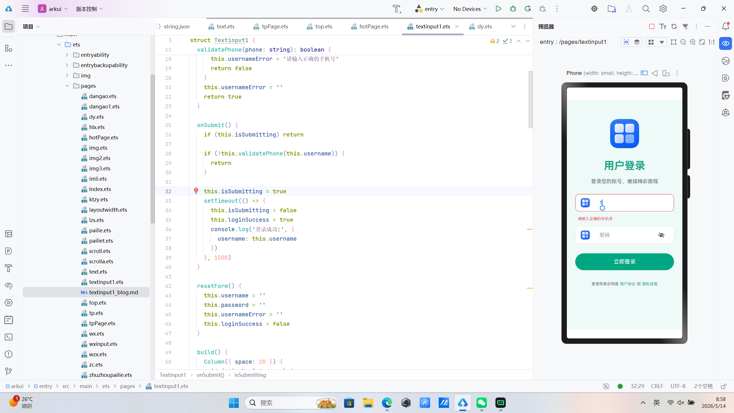
本文将深入解析基于 HarmonyOS ArkUI 框架开发的用户登录页面 ,该页面采用声明式UI开发模式,展示了如何构建一个具有手机号验证功能的移动端登录表单。
二、技术架构
2.1 组件结构设计
页面采用分层架构设计,主要包含以下组件层次:
Column (根容器)
├── 成功状态视图
│   ├── Image (Logo)
│   ├── Text (成功提示)
│   ├── Text (欢迎信息)
│   └── Button (返回按钮)
└── 登录表单视图
    ├── Image (Logo)
    ├── Text (标题)
    ├── Text (副标题)
    ├── Column (输入框容器)
    │   ├── Row (手机号输入框)
    │   └── Row (密码输入框)
    ├── Button (登录按钮)
    └── Row (用户协议)
2.2 核心状态管理
页面使用 @State 装饰器管理响应式状态:
@State username: string = ''        // 手机号输入值
@State password: string = ''        // 密码输入值
@State usernameError: string = ''   // 手机号错误提示
@State isSubmitting: boolean = false // 提交状态
@State loginSuccess: boolean = false // 成功状态
状态流转逻辑:
- 用户输入 → 更新对应状态 → UI自动刷新
- 点击登录 → 验证手机号格式 → 验证通过 →
isSubmitting = true→ 显示加载状态 → 模拟请求 →loginSuccess = true→ 切换成功视图
三、关键技术实现
3.1 声明式UI构建
ArkUI 采用声明式编程范式,通过 build() 方法描述UI结构:
build() {
  Column({ space: 20 }) {
    if (this.loginSuccess) {
      // 成功状态UI
    } else {
      // 登录表单UI
    }
  }
  .width('100%')
  .height('100%')
  .backgroundColor('#f0faf8')
}
设计亮点:
- 使用条件渲染实现视图切换
- 通过链式调用设置容器属性
- 百分比布局适配不同屏幕尺寸
3.2 手机号验证机制
页面实现了完整的手机号验证功能:
validatePhone(phone: string): boolean {
  if (!phone) {
    this.usernameError = '请输入手机号'
    return false
  }
  const regex = /^1[3-9]\d{9}$/
  if (!regex.test(phone)) {
    this.usernameError = '请输入正确的手机号'
    return false
  }
  this.usernameError = ''
  return true
}
验证规则:
- 非空验证:必须输入手机号
- 格式验证:1开头,第二位3-9,共11位数字
- 实时反馈:输入时自动清除错误提示
3.3 输入框组件封装
输入框采用 Row 容器封装,实现图标+输入框的组合:
Row({ space: 14 }) {
  Image($r("app.media.startIcon"))
    .width(28)
    .height(28)
    .margin({ left: 16 })
  TextInput({ placeholder: '手机号', text: this.username })
    .height(52)
    .borderRadius(12)
    .backgroundColor(Color.White)
    .width('75%')
    .fontSize(16)
    .placeholderColor('#999')
    .type(InputType.Number)
    .onChange((value: string) => {
      this.username = value
      if (this.usernameError) {
        this.validatePhone(value)
      }
    })
}
.width('85%')
.backgroundColor('#ffffff')
.borderRadius(12)
.border({
  width: 1,
  color: this.usernameError ? '#ff4757' : '#e8e8e8',
  radius: 12
})
.shadow({ radius: 4, color: '#00000010', offsetX: 0, offsetY: 2 })
技术要点:
- 使用
$r()引用应用资源 TextInput的onChange事件实现双向绑定- 通过
border()和shadow()实现卡片式效果 - 错误状态下边框变红,提供视觉反馈
3.4 按钮交互设计
登录按钮包含加载状态和正常状态的切换:
Button(this.isSubmitting ? '登录中...' : '立即登录')
  .width('85%')
  .height(52)
  .backgroundColor('#1FA485')
  .fontColor('#fff')
  .borderRadius(26)
  .fontSize(17)
  .fontWeight(FontWeight.Medium)
  .enabled(!this.isSubmitting)
  .shadow({ radius: 6, color: '#1FA48530', offsetX: 0, offsetY: 4 })
  .onClick(() => this.onSubmit())
交互特性:
- 动态按钮文本
enabled()控制按钮可用性- 主题色阴影增强视觉层次
3.5 提交逻辑实现
onSubmit() {
  if (this.isSubmitting) return

  if (!this.validatePhone(this.username)) {
    return
  }

  this.isSubmitting = true
  setTimeout(() => {
    this.isSubmitting = false
    this.loginSuccess = true
    console.log('登录成功:', {
      username: this.username
    })
  }, 1500)
}
设计思路:
- 使用状态标志防止重复提交
- 先验证手机号格式再执行登录
- 使用
setTimeout模拟网络请求 - 状态更新自动触发UI重新渲染
四、视觉设计解析
4.1 配色方案
| 元素 | 颜色值 | 用途 |
|---|---|---|
| 主题色 | #1FA485 |
标题、按钮、链接 |
| 页面背景 | #f0faf8 |
整体背景色 |
| 输入框背景 | #ffffff |
表单输入区域 |
| 边框颜色 | #e8e8e8 |
输入框边框 |
| 错误颜色 | #ff4757 |
错误提示和边框 |
| 文字颜色 | #666 |
辅助文字 |
配色原则:
- 绿色主题传递信任与活力
- 浅色背景提高阅读舒适度
- 对比色按钮增强可点击性
- 红色错误提示醒目直观
4.2 布局策略
响应式设计要点:
- 使用百分比宽度适配不同屏幕
Column的space属性控制间距justifyContent(FlexAlign.Start)确保顶部对齐
间距系统:
- 输入框间距:16vp
- 内容区域宽度:85%
- 按钮圆角:26vp(胶囊形)
五、ArkUI 核心特性应用
5.1 装饰器机制
| 装饰器 | 作用 | 示例 |
|---|---|---|
@Entry |
标记页面入口组件 | @Entry struct Textinput1 |
@Component |
定义可复用组件 | @Component struct Textinput1 |
@State |
声明组件内部状态 | @State username: string = '' |
5.2 事件处理
- 输入事件:
onChange监听输入变化,实现实时验证 - 点击事件:
onClick处理按钮交互 - 状态联动:状态变化自动触发UI更新
5.3 资源引用
Image($r("app.media.startIcon")) // 应用资源
$r() 方法用于引用 resources 目录下的资源文件,支持国际化和多主题切换。
六、性能优化考虑
6.1 状态管理优化
- 使用最小粒度的状态变量
- 避免不必要的状态更新
- 错误状态仅在需要时显示
6.2 布局优化
- 减少嵌套层级
- 使用
layoutWeight优化空间分配 - 避免过度绘制
6.3 渲染优化
- 条件渲染避免不必要的组件创建
- 错误提示使用条件渲染延迟创建
七、总结
本文解析的用户登录页面展示了 ArkUI 开发的最佳实践:
- 声明式UI:简洁直观的UI描述方式,通过条件渲染实现视图切换
- 响应式状态:状态驱动的UI更新机制,状态变化自动刷新界面
- 表单验证:实现完整的手机号格式验证,提供实时反馈
- 视觉设计:统一的配色和布局规范,错误状态清晰可见
- 交互体验:加载状态管理、防止重复提交、成功状态展示
该页面架构清晰、代码简洁,是学习 HarmonyOS ArkUI 开发的优秀范例。通过掌握这些核心技术,可以快速构建高质量的 HarmonyOS 应用界面。
代码位置:entry/src/main/ets/pages/textinput1.ets
技术栈:HarmonyOS ArkUI 3.0 + TypeScript
@Entry
@Component
struct Textinput1 {
  @State username: string = ''
  @State password: string = ''

  @State usernameError: string = ''
  @State isSubmitting: boolean = false
  @State loginSuccess: boolean = false

  validatePhone(phone: string): boolean {
    if (!phone) {
      this.usernameError = '请输入手机号'
      return false
    }
    const regex = /^1[3-9]\d{9}$/
    if (!regex.test(phone)) {
      this.usernameError = '请输入正确的手机号'
      return false
    }
    this.usernameError = ''
    return true
  }

  onSubmit() {
    if (this.isSubmitting) return

    if (!this.validatePhone(this.username)) {
      return
    }

    this.isSubmitting = true
    setTimeout(() => {
      this.isSubmitting = false
      this.loginSuccess = true
      console.log('登录成功:', {
        username: this.username
      })
    }, 1500)
  }

  resetForm() {
    this.username = ''
    this.password = ''
    this.usernameError = ''
    this.loginSuccess = false
  }

  build() {
    Column({ space: 20 }) {
      if (this.loginSuccess) {
        Column({ space: 24 }) {
          Image($r("app.media.startIcon"))
            .width(100)
            .height(100)
          Text('登录成功!')
            .fontSize(28)
            .fontWeight(FontWeight.Bold)
            .fontColor('#1FA485')
          Text('欢迎回来,' + (this.username || '用户'))
            .fontSize(16)
            .fontColor('#666')
          Button('返回重新登录')
            .width('80%')
            .height(48)
            .backgroundColor('#1FA485')
            .fontColor('#fff')
            .borderRadius(24)
            .onClick(() => this.resetForm())
        }
        .width('100%')
        .alignItems(HorizontalAlign.Center)
        .justifyContent(FlexAlign.Center)
      } else {
        Image($r("app.media.startIcon"))
          .width(90)
          .height(90)
          .margin({ top: 60 })

        Text('用户登录')
          .fontSize(32)
          .fontWeight(FontWeight.Bold)
          .fontColor('#1FA485')
          .margin({ top: 16 })

        Text('登录您的账号,继续精彩旅程')
          .fontSize(16)
          .fontColor('#666')
          .margin({ bottom: 10 })

        Column({ space: 16 }) {
          Row({ space: 14 }) {
            Image($r("app.media.startIcon"))
              .width(28)
              .height(28)
              .margin({ left: 16 })
            TextInput({ placeholder: '手机号', text: this.username })
              .height(52)
              .borderRadius(12)
              .backgroundColor(Color.White)
              .width('75%')
              .fontSize(16)
              .placeholderColor('#999')
              .type(InputType.Number)
              .onChange((value: string) => {
                this.username = value
                if (this.usernameError) {
                  this.validatePhone(value)
                }
              })
          }
          .width('85%')
          .backgroundColor('#ffffff')
          .borderRadius(12)
          .border({
            width: 1,
            color: this.usernameError ? '#ff4757' : '#e8e8e8',
            radius: 12
          })
          .shadow({ radius: 4, color: '#00000010', offsetX: 0, offsetY: 2 })

          if (this.usernameError) {
            Text(this.usernameError)
              .fontSize(12)
              .fontColor('#ff4757')
              .width('85%')
              .textAlign(TextAlign.Start)
              .padding({ left: 8 })
          }

          Row({ space: 14 }) {
            Image($r("app.media.startIcon"))
              .width(28)
              .height(28)
              .margin({ left: 16 })
            TextInput({ placeholder: '密码', text: this.password })
              .height(52)
              .borderRadius(12)
              .backgroundColor(Color.White)
              .width('75%')
              .fontSize(16)
              .placeholderColor('#999')
              .type(InputType.Password)
              .onChange((value: string) => {
                this.password = value
              })
          }
          .width('85%')
          .backgroundColor('#ffffff')
          .borderRadius(12)
          .border({ width: 1, color: '#e8e8e8', radius: 12 })
          .shadow({ radius: 4, color: '#00000010', offsetX: 0, offsetY: 2 })
        }
        .width('100%')
        .alignItems(HorizontalAlign.Center)

        Button(this.isSubmitting ? '登录中...' : '立即登录')
          .width('85%')
          .height(52)
          .backgroundColor('#1FA485')
          .fontColor('#fff')
          .borderRadius(26)
          .fontSize(17)
          .fontWeight(FontWeight.Medium)
          .enabled(!this.isSubmitting)
          .shadow({ radius: 6, color: '#1FA48530', offsetX: 0, offsetY: 4 })
          .onClick(() => this.onSubmit())
          .margin({ top: 10 })

        Row({ space: 4 }) {
          Text('登录即表示同意')
            .fontSize(12)
            .fontColor('#666')
          Text('用户协议')
            .fontSize(12)
            .fontColor('#1FA485')
          Text('和')
            .fontSize(12)
            .fontColor('#666')
          Text('隐私政策')
            .fontSize(12)
            .fontColor('#1FA485')
        }
        .margin({ top: 16, bottom: 30 })
      }
    }
    .width('100%')
    .height('100%')
    .backgroundColor('#f0faf8')
    .alignItems(HorizontalAlign.Center)
    .justifyContent(FlexAlign.Start)
  }
}