
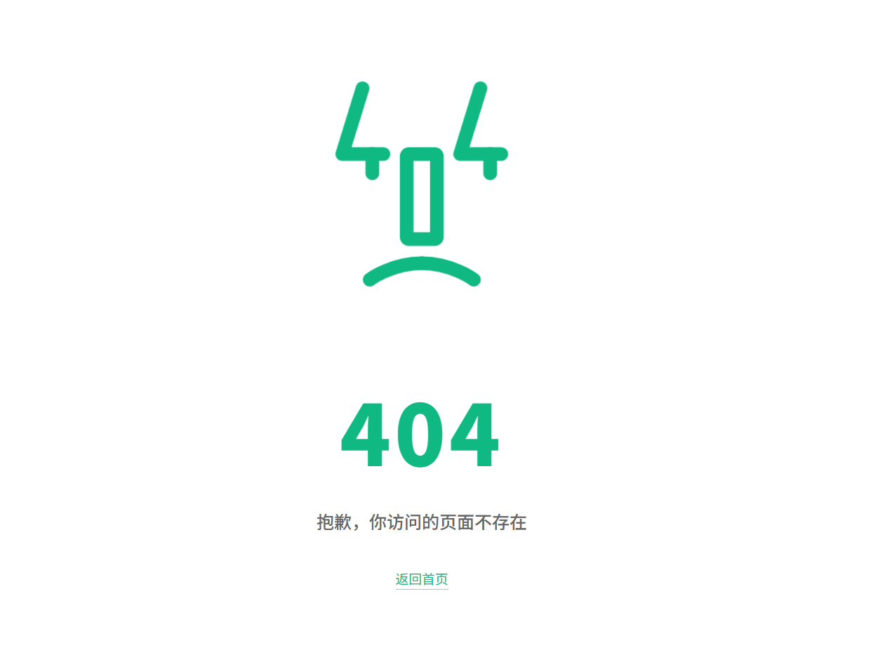
会眨眼的404页面:HTML+CSS+SVG实现,复制即用
纯 HTML+CSS+SVG 实现的动画 404 报错页面,不需要 JavaScript。页面包含眨眼、眼球移动、口鼻入场等动画效果,同时适配移动端,复制源码即可部署到自己网站,给站点增加一个趣味小彩蛋。
预览效果
代码
<!DOCTYPE html>
<html lang="zh-CN">
<head>
    <meta charset="UTF-8">
    <meta name="viewport" content="width=device-width, initial-scale=1.0">
    <title>404 - 页面不存在</title>
    <style>
        * { margin: 0; padding: 0; box-sizing: border-box; }

        .error-page {
            display: flex;
            flex-direction: column;
            justify-content: center;
            align-items: center;
            min-height: 70vh;
            padding: 40px 20px;
            color: #10B981;
        }

        .face-container {
            display: flex;
            justify-content: center;
            align-items: center;
            height: 400px;
            background: transparent;
        }

        .face { width: 200px; }

        .face__eyes, .face__eye-lid, .face__mouth-left, .face__mouth-right, .face__nose, .face__pupil {
            animation: eyes 1s 0.3s forwards;
        }

        .face__eye-lid, .face__pupil {
            animation-duration: 4s;
            animation-delay: 1.3s;
            animation-iteration-count: infinite;
        }

        .face__eye-lid { animation-name: eye-lid; }
        .face__mouth-left { animation-name: mouth-left; }
        .face__mouth-right { animation-name: mouth-right; }
        .face__nose { animation-name: nose; }
        .face__pupil { animation-name: pupil; }

        @keyframes eye-lid {
            0%, 40%, 45%, 100% { transform: translateY(0); }
            42.5% { transform: translateY(17.5px); }
        }
        @keyframes eyes {
            from { transform: translateY(112.5px); }
            to { transform: translateY(15px); }
        }
        @keyframes pupil {
            0%, 37.5%, 40%, 45%, 87.5%, 100% { stroke-dashoffset: 0; transform: translate(0, 0); }
            12.5%, 25%, 62.5%, 75% { transform: translate(-35px, 0); }
            42.5% { stroke-dashoffset: 35; transform: translate(0, 17.5px); }
        }
        @keyframes mouth-left {
            from, 50% { stroke-dashoffset: -102; }
            to { stroke-dashoffset: 0; }
        }
        @keyframes mouth-right {
            from, 50% { stroke-dashoffset: 102; }
            to { stroke-dashoffset: 0; }
        }
        @keyframes nose {
            from { transform: translate(0, 0); }
            to { transform: translate(0, 22.5px); }
        }

        .error-code {
            font-size: 96px;
            font-weight: 900;
            letter-spacing: 4px;
            margin: 10px 0 20px;
            animation: fadeIn 1s ease-out 1.2s backwards;
        }

        .error-title {
            font-size: 20px;
            font-weight: 500;
            color: #666;
            margin-bottom: 40px;
            animation: fadeIn 1s ease-out 1.4s backwards;
        }

        .back-link {
            font-size: 15px;
            color: #10B981;
            text-decoration: none;
            border-bottom: 1px solid #6ee7b7;
            padding-bottom: 2px;
            transition: border-color 0.25s ease;
            animation: fadeIn 1s ease-out 1.6s backwards;
        }
        .back-link:hover { border-color: #10B981; }

        @keyframes fadeIn {
            from { opacity: 0; transform: translateY(15px); }
            to   { opacity: 1; transform: translateY(0); }
        }

        @media (max-width: 768px) {
            .face-container { height: 300px; }
            .face { width: 150px; }
            .error-code { font-size: 72px; }
            .error-title { font-size: 17px; }
        }
    </style>
</head>
<body>
<main class="error-page">
    <div class="face-container">
        <svg class="face" viewBox="0 0 320 380">
            <g fill="none" stroke="currentColor" stroke-linecap="round" stroke-linejoin="round" stroke-width="25">
                <g class="face__eyes" transform="translate(0,112.5)">
                    <g transform="translate(15,0)">
                        <polyline class="face__eye-lid" points="37,0 0,120 75,120"></polyline>
                        <polyline class="face__pupil" points="55,120 55,155" stroke-dasharray="35 35"></polyline>
                    </g>
                    <g transform="translate(230,0)">
                        <polyline class="face__eye-lid" points="37,0 0,120 75,120"></polyline>
                        <polyline class="face__pupil" points="55,120 55,155" stroke-dasharray="35 35"></polyline>
                    </g>
                </g>
                <rect class="face__nose" x="132.5" y="112.5" width="55" height="155" rx="4" ry="4"></rect>
                <g transform="translate(65,334)" stroke-dasharray="102 102">
                    <path class="face__mouth-left" d="M 0 30 C 0 30 40 0 95 0"></path>
                    <path class="face__mouth-right" d="M 95 0 C 150 0 190 30 190 30"></path>
                </g>
            </g>
        </svg>
    </div>
    <div class="error-code">404</div>
    <p class="error-title">抱歉,你访问的页面不存在</p>
    <a class="back-link" href="./">返回首页</a>
</main>
</body>
</html>